MicroLayout Library
If you're working on an IoT project with a display, then you're almost certainly wanting to show information to a user. Drawing that information using drawing primitives can be both cumbersome and non-portable. We at Wilderness Labs have released our MicroLayout library to help .NET developers easily create lightweight HMIs for their projects.
MicroLayout uses a "screen with controls" paradigm for layout out your user interface. A DisplayScreen encapsulates and abstracts the physical display using MicroGraphics. To that DisplayScreen, you can add any number of Controls to the DisplayScreen.Controls collection. MicroLayout currently supports seven controls: Box, Circle, Label, Picture, LineChart, ProgressBar and Button which you can then use to design your user interface using pixel-based coordinates and sizes.
For example, if you want to create a box with a label on it, you simply Create a Box and a Label control and then add them to the DisplayScreen in back-to-front order.
displayScreen = new DisplayScreen(display)
{
    BackgroundColor = backgroundColor
};

displayScreen.Controls.Add(
    new Box(0, 0, displayScreen.Width / 2, displayScreen.Height / 2)
    {
        ForeColor = Color.Red
    },
    new Label(0, 0, displayScreen.Width / 2, displayScreen.Height / 2)
    {
        Text = "Hello World!",
        TextColor = Color.White,
        VerticalAlignment = VerticalAlignment.Center,
        HorizontalAlignment = HorizontalAlignment.Center
    }
);
It should look like this on a 320x240 screen.

Controls
Box
Draws a colored rectangle:
displayScreen.Controls.Add(new Box(
    left: 20,
    top: 20,
    width: displayScreen.Width - 40,
    height: displayScreen.Height - 40)
{
    ForeColor = Color.Red
});
The code sample above draws a red rectangle:

GradientBox
Draws a gradient colored rectangle:
displayScreen.Controls.Add(new GradientBox(
    left: 20,
    top: 20,
    width: displayScreen.Width - 40,
    height: displayScreen.Height - 40)
{
    StartColor = Color.Red,
    EndColor = Color.Blue,
    IsHorizontal = true,
});
The code sample above draws a red-to-blue gradient rectangle:

Circle
Draws a colored circle:
displayScreen.Controls.Add(new Circle(
    centerX: displayScreen.Width / 2,
    centerY: displayScreen.Height / 2,
    radius: displayScreen.Height / 3)
{
    ForeColor = Color.Red,
    IsFilled = true
});
The code sample above draws a red circle:

Label
Draws a line of text.
displayScreen.Controls.Add(new Label(
    left: 20,
    top: 20,
    width: displayScreen.Width - 40,
    height: displayScreen.Height - 40)
{
    Text = "Hello World",
    TextColor = Color.Red,
    BackColor = Color.White,
    Font = new Font12x20(),
    HorizontalAlignment = HorizontalAlignment.Center,
    VerticalAlignment = VerticalAlignment.Center,
});
The code sample draws a label in the center, red color text and white background:

Picture
Draws bitmap images. Add .bmp files in your project and make sure you select EmbeddedContent in the BuildAction property.
var image = Image.LoadFromResource("<PROJECT NAMESPACE>.<FILENAME>.bmp");

displayScreen.Controls.Add(new Picture(
    left: 20,
    top: 20,
    width: displayScreen.Width - 40,
    height: displayScreen.Height - 40,
    image: image)
{
    BackColor = Color.DarkBlue
});
The code sample draws a bitmap image in the center at its actual image dimensions and has a dark blue background for the entire width and height specified.

LineChart
Draws a line chart based on a series of points. For every sequence of readings it needs its own LineChartSeries which are added to the LineChart collection Series.
var data = new List<double>
{
    1.2,
    1.5,
    2.2,
    2.5,
    1.8
};

var series = new LineChartSeries()
{
    LineColor = Color.Red,
    PointColor = Color.Green,
    LineStroke = 4,
    PointSize = 6,
    ShowLines = true,
    ShowPoints = true,
};

for (int i = 0; i < data.Count; i++)
{
    series.Points.Add(i*2, data[i]);
}

var chart = new LineChart(
    left: 20,
    top: 20,
    width: displayScreen.Width - 40,
    height: displayScreen.Height - 40)
{
    BackgroundColor = Color.DarkBlue,
    ShowYAxisLabels = true
};
chart.Series.Add(series);

displayScreen.Controls.Add(chart);
The code sample above plots a line chart based on the list of double of 5 values. With LineChartSeries you can specify the style of the curve, and in LineChart you can specofy the style of the chart itself (axis colors, background, etc.).

VerticalBarChart
Draws a vertical bar chart based on an array of float values.
var random = new Random();
var series = new float[10];

for (var i = 0; i < series.Length; i++)
{
    series[i] = random.NextSingle() * 10;
}

var chart = new VerticalBarChart(
    20,
    20,
    displayScreen.Width - 40,
    displayScreen.Height - 40,
    series)
{
    AxisLabelColor = Color.Red,
    AxisColor = Color.DarkRed,
    AxisStroke = 3,
    BarSpacing = 3,
    SeriesColor = Color.DarkBlue,
    AxisFont = new Font6x8(),
};

displayScreen.Controls.Add(chart);
The code sample above plots ten vertical bar charts with random values from 0-10. You can specify the style of the chart itself for things like axis colors, stroke, axis font, etc.

ProgressBar
Draws a colored progress bar. To fill the progress bar, you would set value from 0..100 to the Value property.
var progressBar = new ProgressBar(
    left: 20,
    top: 40,
    width: displayScreen.Width - 40,
    height: displayScreen.Height - 80)
{
    BackColor = Color.DarkBlue,
    ValueColor = Color.Magenta,
    BorderColor = Color.Red,
};
displayScreen.Controls.Add(progressBar);

for (int i = 0; i < 10; i++)
{
    progressBar.Value = i * 10;
    await Task.Delay(1000);
}
The code sample above draws a magenta ProgressBar with a dark blue background and a red border:

Button
Draws an onscreen button. This control would only work on touch screen capable displays.
var button = new Button(
    left: 20,
    top: 20,
    width: displayScreen.Width - 40,
    height: displayScreen.Height - 40)
{
    Text = "Hello World",
    TextColor = Color.Red,
    ForeColor = Color.DarkBlue,
    ShadowColor = Color.DarkGray,
    HighlightColor = Color.Red,
    PressedColor = Color.Green,
    Font = new Font12x20()
};
displayScreen.Controls.Add(button);

button.Clicked += (s, e) =>
{
    Resolver.Log.Info("Clicked");
};
The sample code draws a dark blue box with red text:

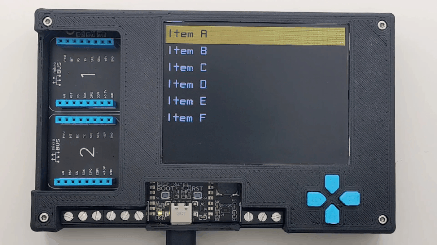
Interactive Menu Example
You can move, resize or recolor the controls at run time to easily create effects and animations. For example, I've created a very simple Menu sample for the ProjectLab v3 that uses Labels for the menu items and a Box that sits behind the labels as a "highlight".
// we compose the screen from the back forward, so put the box on first
_highlightBox = new Box(0, -1, screen.Width, ItemHeight + 2)
{
    ForeColor = SelectionColor,
    Filled = true,
};
screen.Controls.Add(_highlightBox);

for (var i = 0; i < items.Length; i++)
{
    _labels[i] = new Label(
        left: x,
        top: i * height,
        width: screen.Width,
        height: height)
    {
        Text = items[i],
        Font = MenuFont,
        BackColor = Color.Transparent,
        VerticalAlignment = VerticalAlignment.Center,
    };

    screen.Controls.Add(_labels[i]);

    y += height;
}
Clicking on the up or down button moves the DisplayBox and changes the TextColor of selected menu item to provide contrast.
public void Draw(int oldRow, int newRow)
{
    _labels[oldRow].TextColor = UnselectedTextColor;
    _labels[newRow].TextColor = SelectedTextColor;

    _highlightBox.Top = _labels[newRow].Top - 1;
}
The project running should look like this:
The full source for the Menu sample is available in the Project Lab Samples repository.
If you would like to try out MicroLayout or would like to contribute, the full source code is available in the Meadow.Foundation repository. If you have any questions or feature requests, reach out to us on our public Slack channel.